Blits Components
Blits Components
Blits Components are a set of off-the-shelf components. Basic and performant reference components, that you can use freely in your next Lightning 3 Blits App.
Unlike a traditional UI components library, the Blits components are not installable from NPM. We're providing the Blits Components as references, intended to be copied and pasted into your App, where you can adapt and customize them further to your App's needs.
Of course, we're all for code reuse. But no App is (or should be) the same. Using the exact same UI component for different Apps is a challenge. Trying to tailor a single component for many use cases, often just leads to bloated components, with features and functionality that you may not need - so why would you import and execute that extra code in your App?
The Blits Components come with little design, and basic functionality. To give you a quick start with your project.
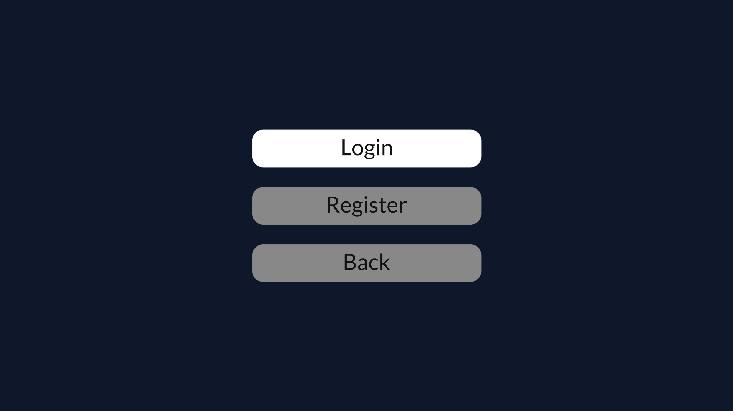
Button
Need a button in your App?
This reference button supports text alignment and changes background color upon focus. Attach an action on `enter`-click and your are good to go.
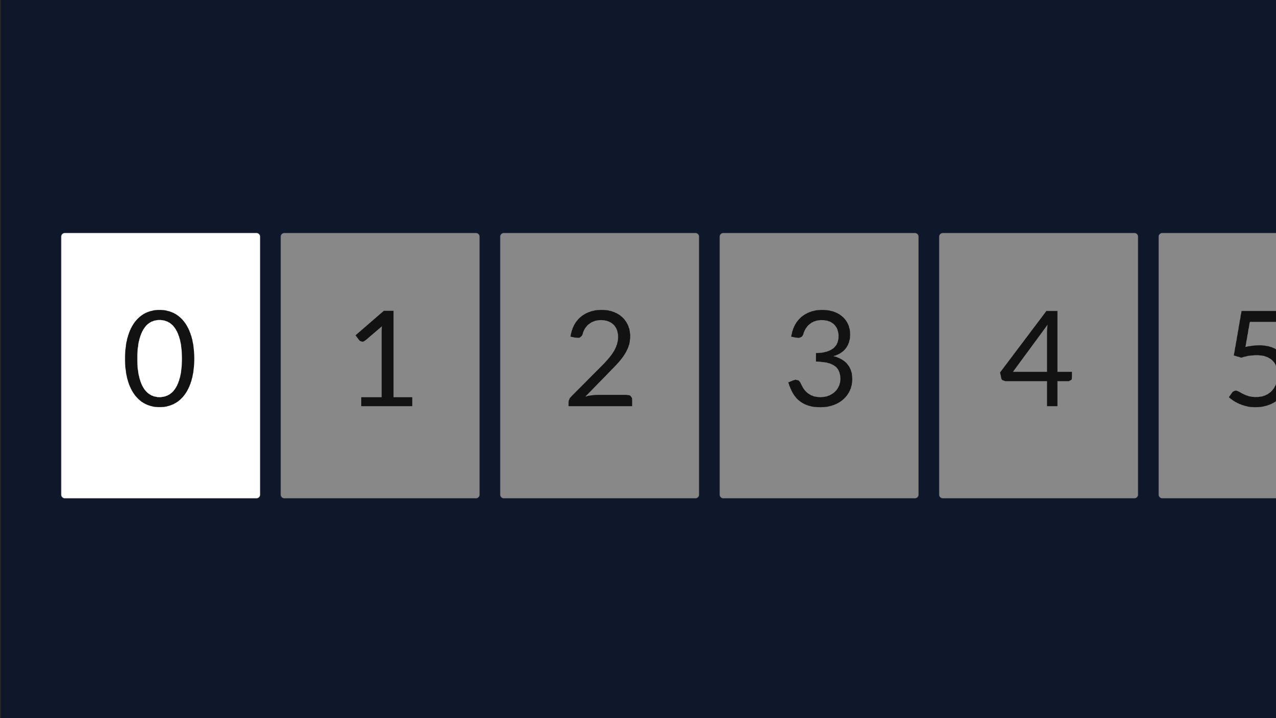
List
More content than fits your App?
This component allows you to scroll through a list of items, and comes with the option to enable continuous scrolling.
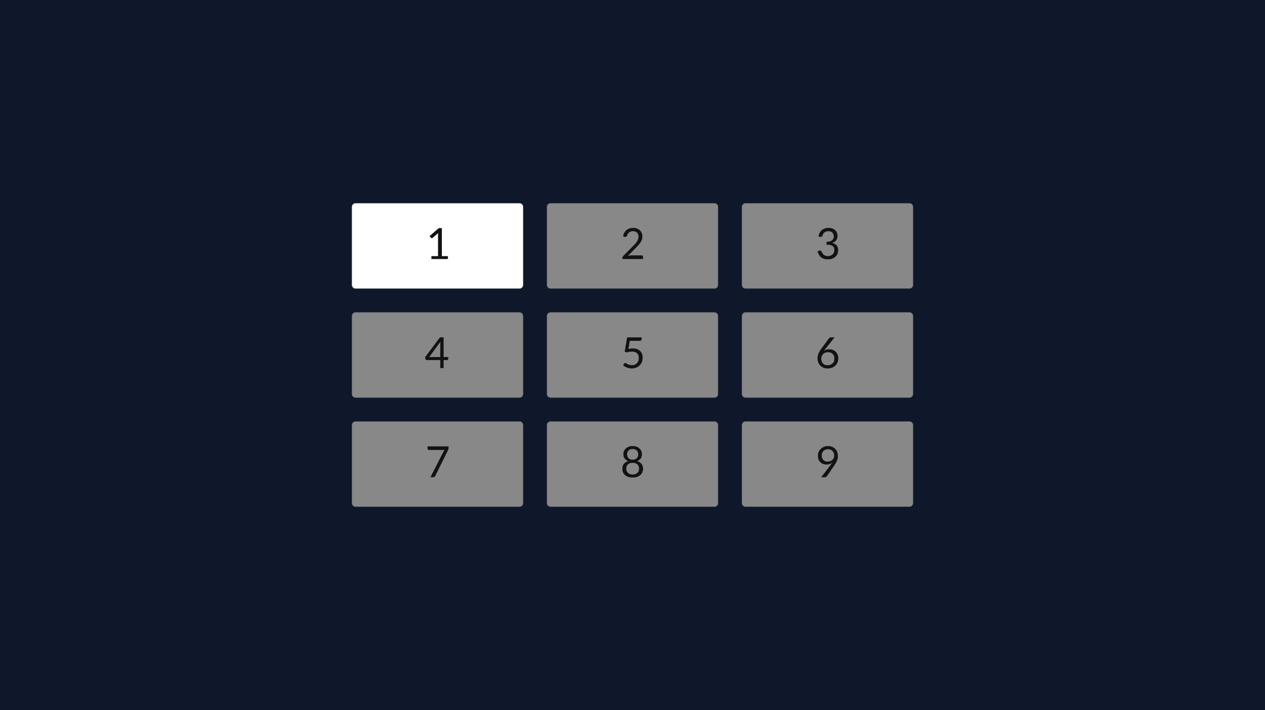
Grid
Display your content in a grid
Grids are designed to give a good overview of all available content. This reference component has all the functionality to navigate through the grid built in.
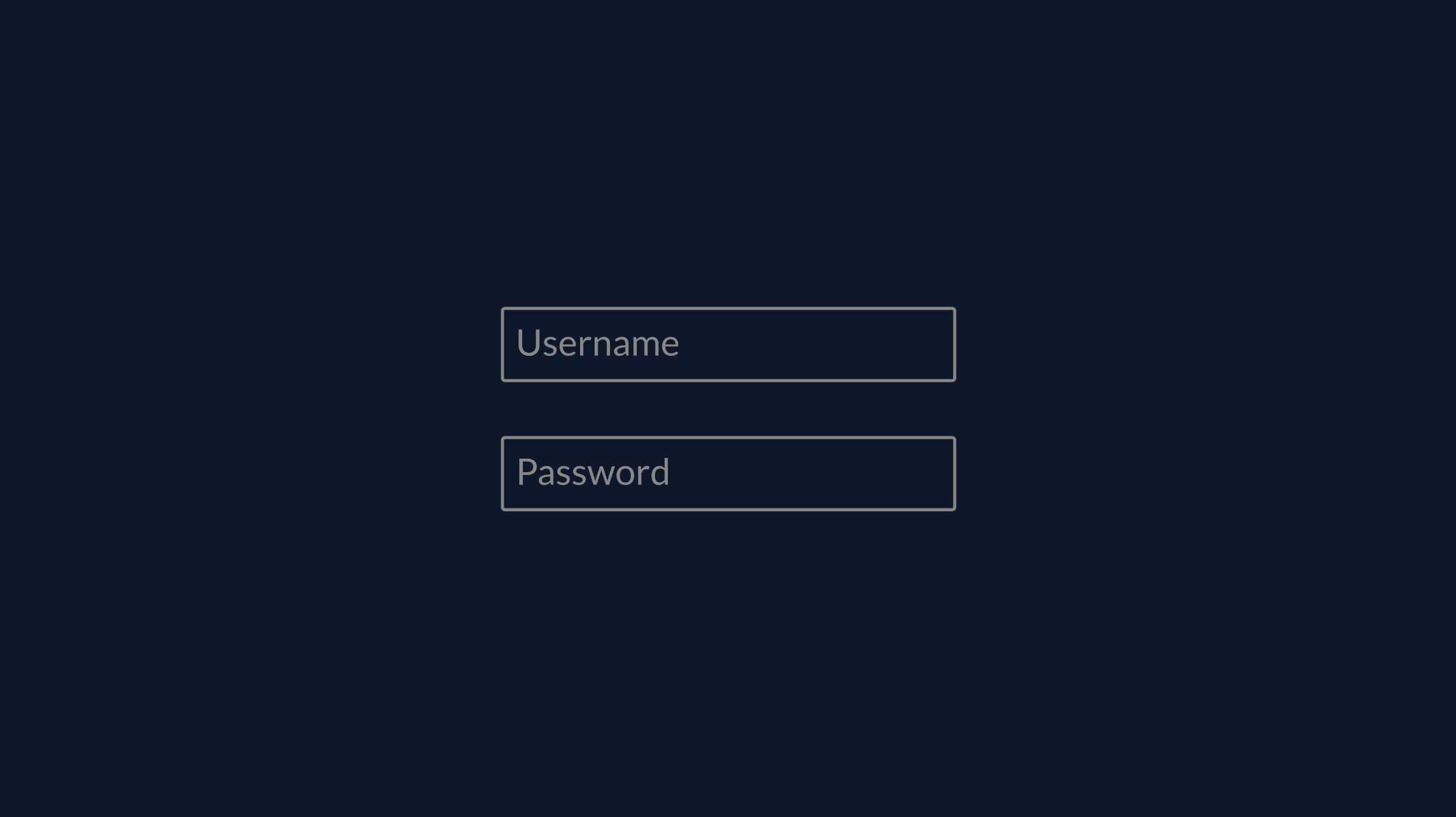
Input
Capture information from your users?
The input component is handy for when you need to create a search view, or sign in page. This component also supports masked input mode in case you need to shield passwords
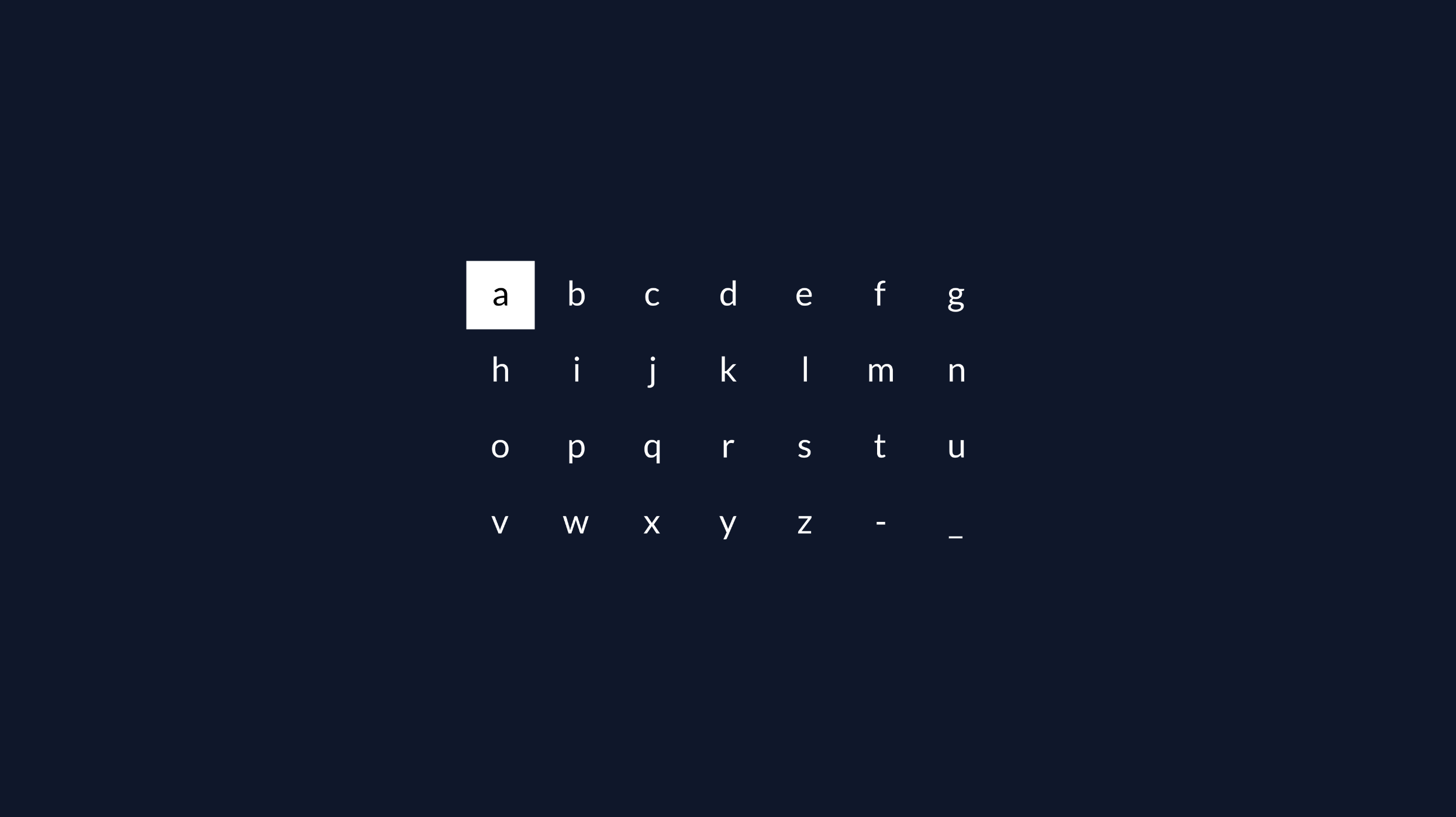
Keyboard
Need an on-screen Keyboard?
With the Keyboard component you can quickly set up a new search view. You can easily combine this component with the Input component.
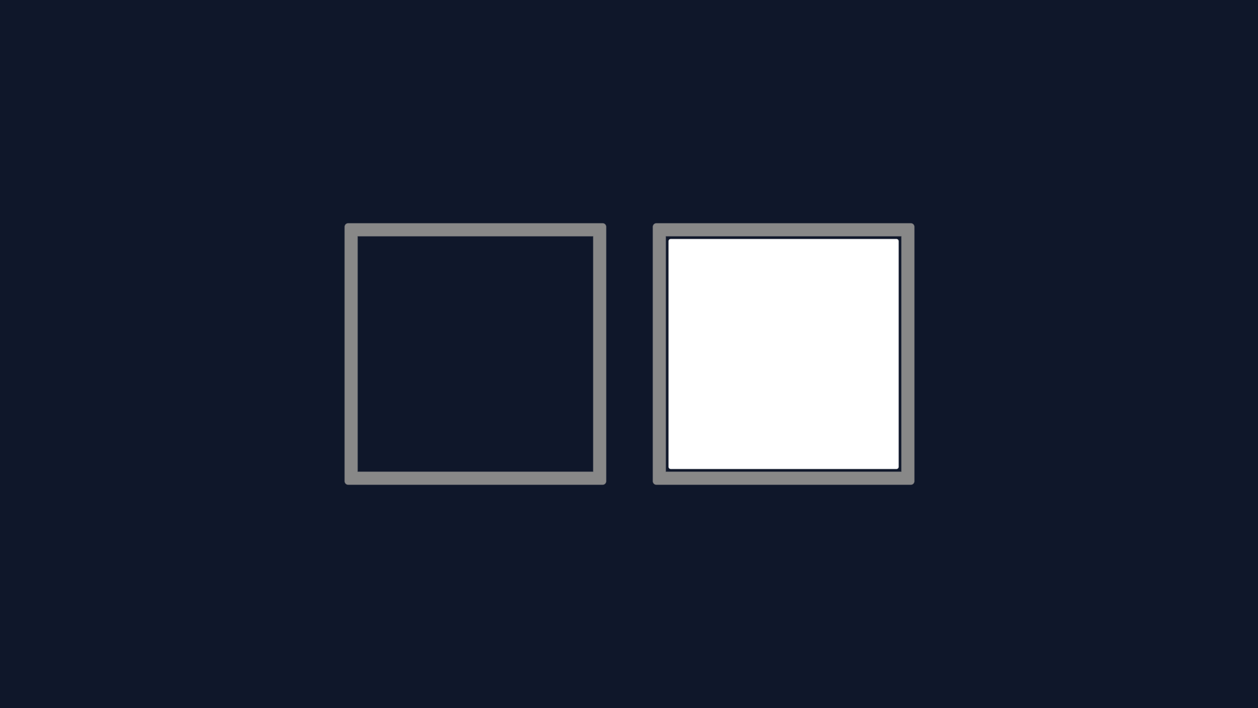
Checkbox
Yes or no?
The checkbox component is handy for settings and login pages. This component gives you a nice basis to build your own forms.
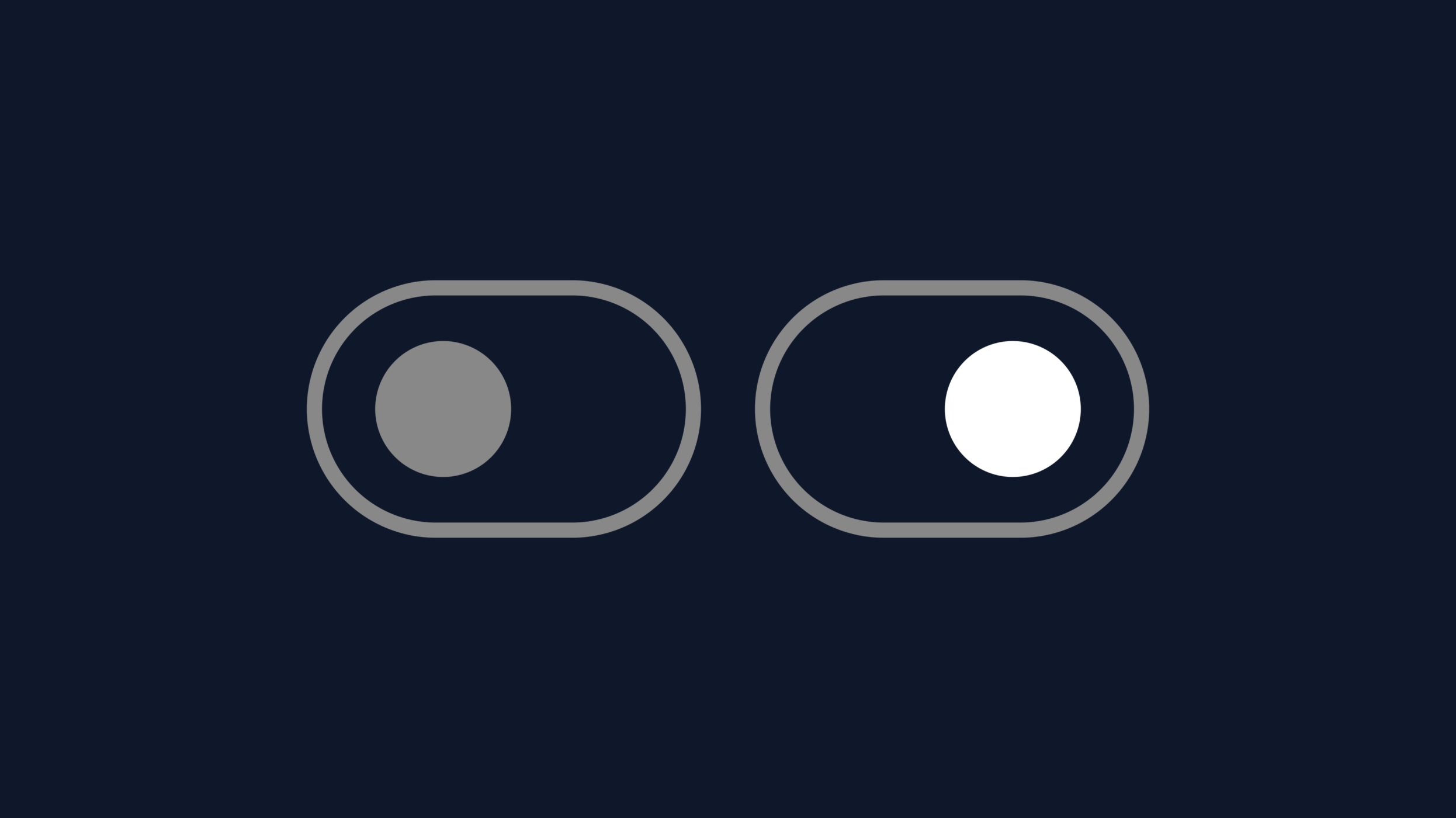
Toggle
On or off
The toggle component is similar to the checkbox component. It's a visually appealing way turn on or off an item in a settings view, for example.
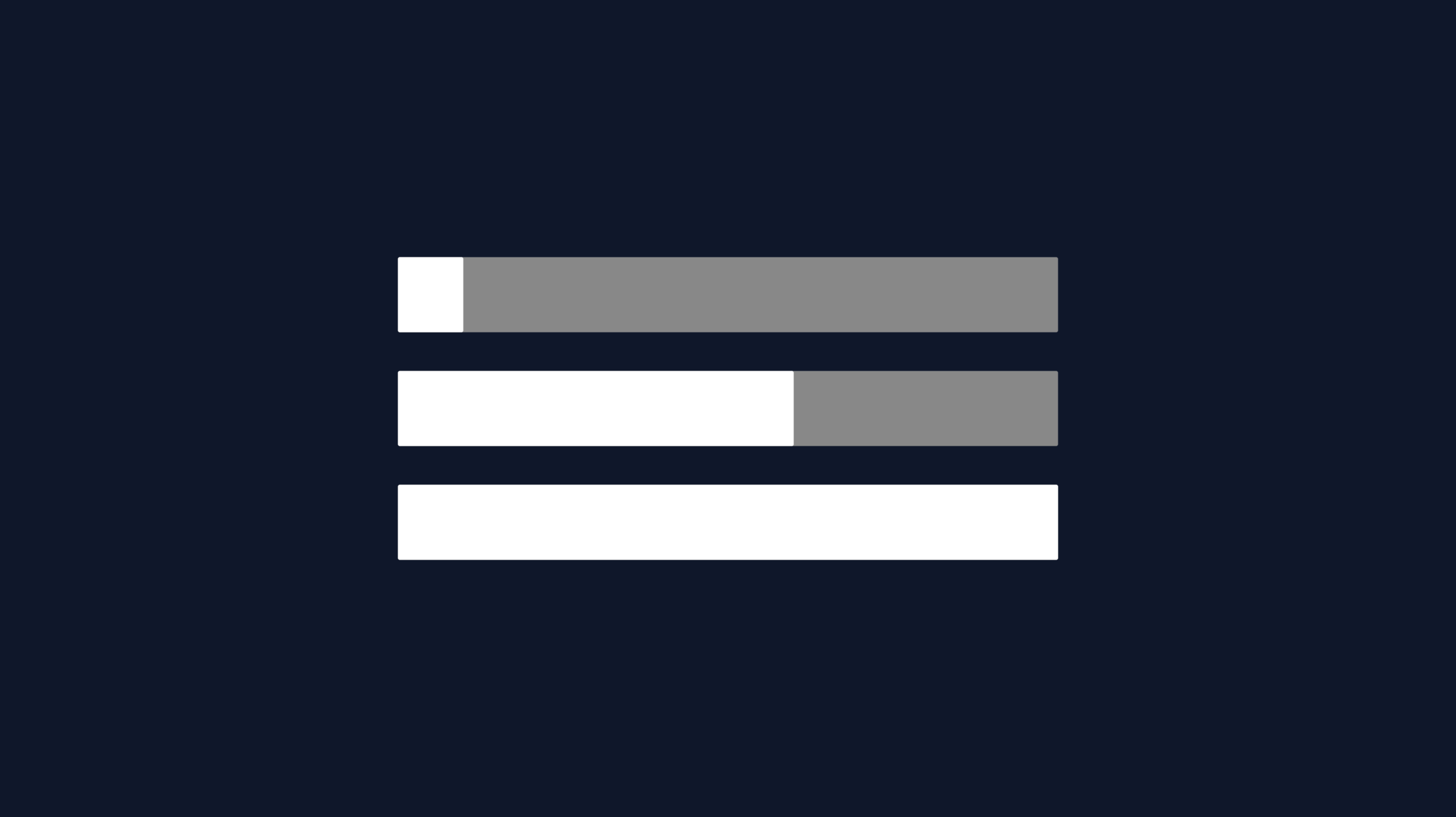
Progress Bar
Are we there yet?
Progress Bars are a visual way to show the progress of something - great to use on loading screens, or in a video player view.